Someone once said: “I buy books as if I am going to live a thousand years in a world without the internet”. That’s me when it comes to books about typography and graphic design.
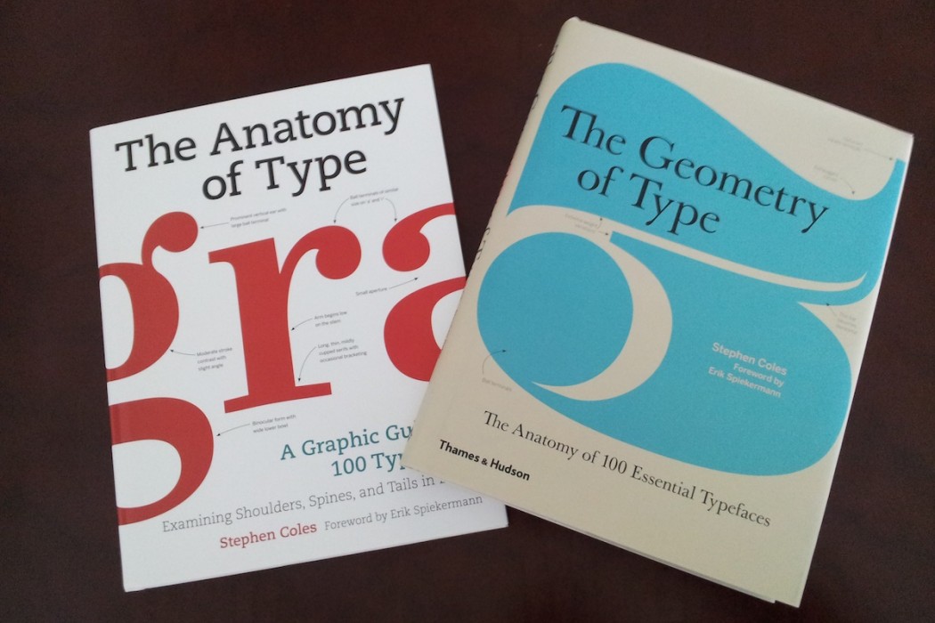
Among the books I have bought recently, I enjoyed one by Stephen Coles called “The Anatomy of Type” I really enjoyed it but it was one of those books that left me wanting for more… So when few weeks ago I found on Amazon another book by Stephen Coles on Typefaces, this time titled “The Geometry of Type” I clicked on “add to cart” immediately!
And few days later, here it was: Geometry of Type by Thames & Hudson, 2013, also known as: Anatomy of Type by Harper Design, 2012.
Yep, the very same book. Title and cover aside, identical in every single aspect: text, layout, size, etc.
After this incident I perused the internet and discovered that there are even websites devoted to bibliophiles where the books with different titles are listed so people can avoid double purchases…
Now, I might – maybe – understand some necessary changes due to translations or adaptations to different languages or cultures, but what on earth explains the change of a title on the U.S. and U.K. editions of a technical book on typefaces? I know out of experience how ‘creative’ people can get in the marketing departments of publish houses, but I really hoped the gentlemen at Thames & Hudson had cared more for words; after all, Anatomy of Type and Geometry of Type are two very different concept in my book (pun intended…). Geometry is the branch of mathematics that deals with space, shape, size. Anatomy refers to he study of the structure of a body, of its parts.
Type Design is already complicated enough to allow for semantic liberties, imho.