Metrorail, the Metro System in Washington D.C. has many qualities: stations are wide, trains are modern and fast; it is a very young enterprise, the first trains began operation in the mid seventies; today, there are 86 Metro stations within a 106.3 mile network. There is only one problem: unless you are born and bred there, there is little chance you’ll find out how to buy a ticket…
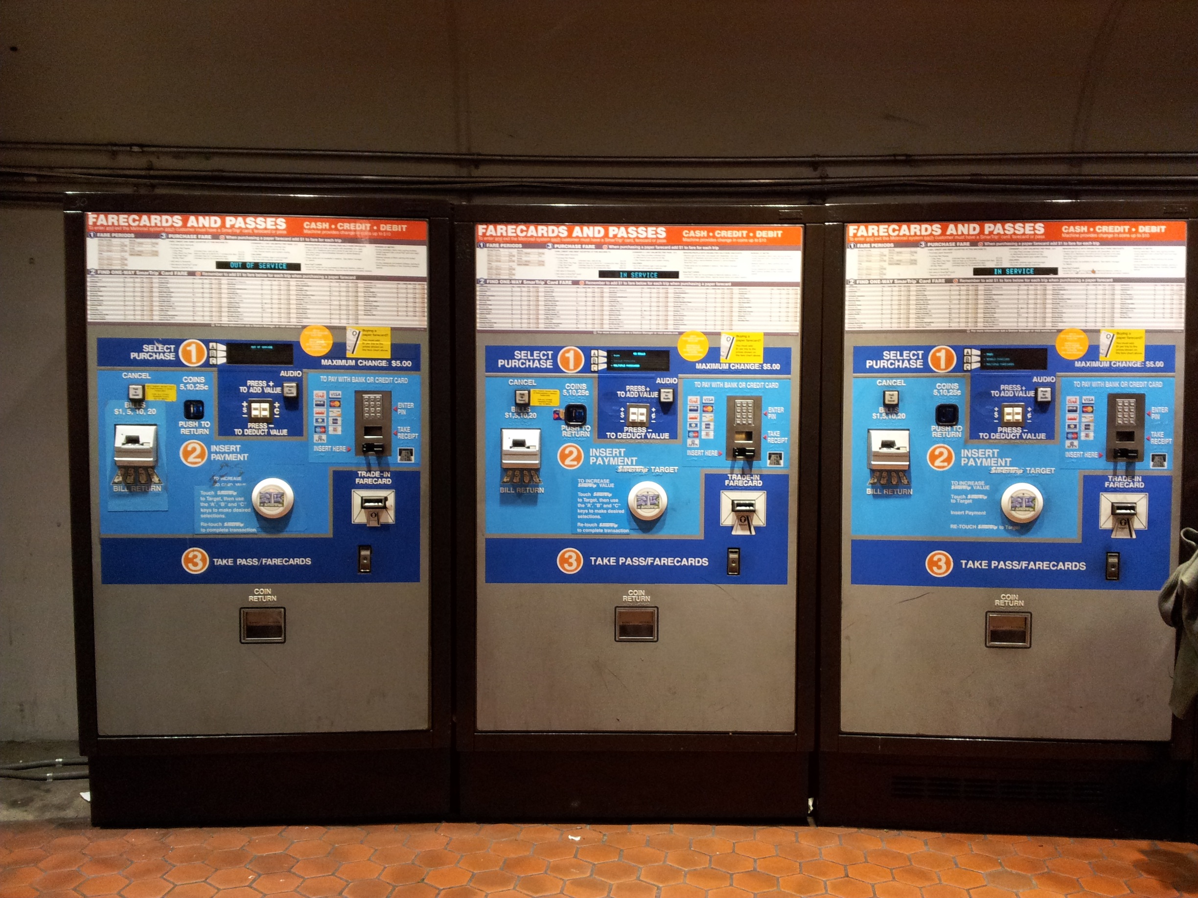
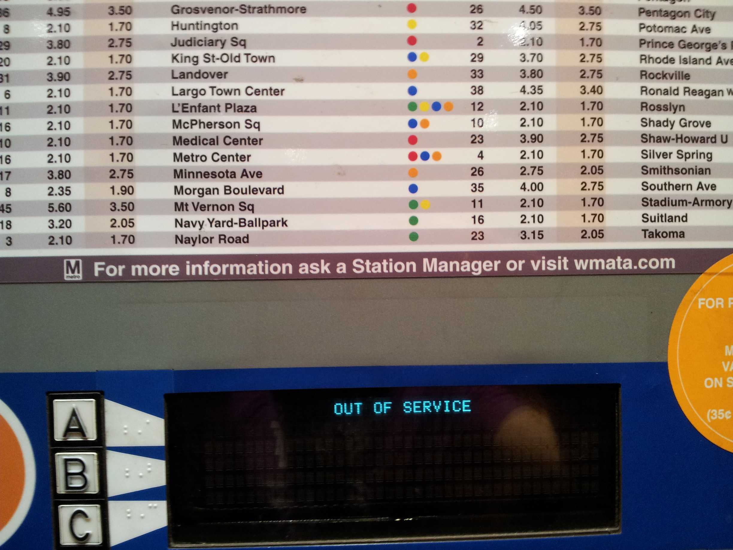
The parade of vending machines in every station in the D.C. Metrorail is quite possibly the most remarkable failure in interactive design I have ever seen: every square centimetres of the panel is occupied by information and one does not need too much time that a lot of it is actually useless.
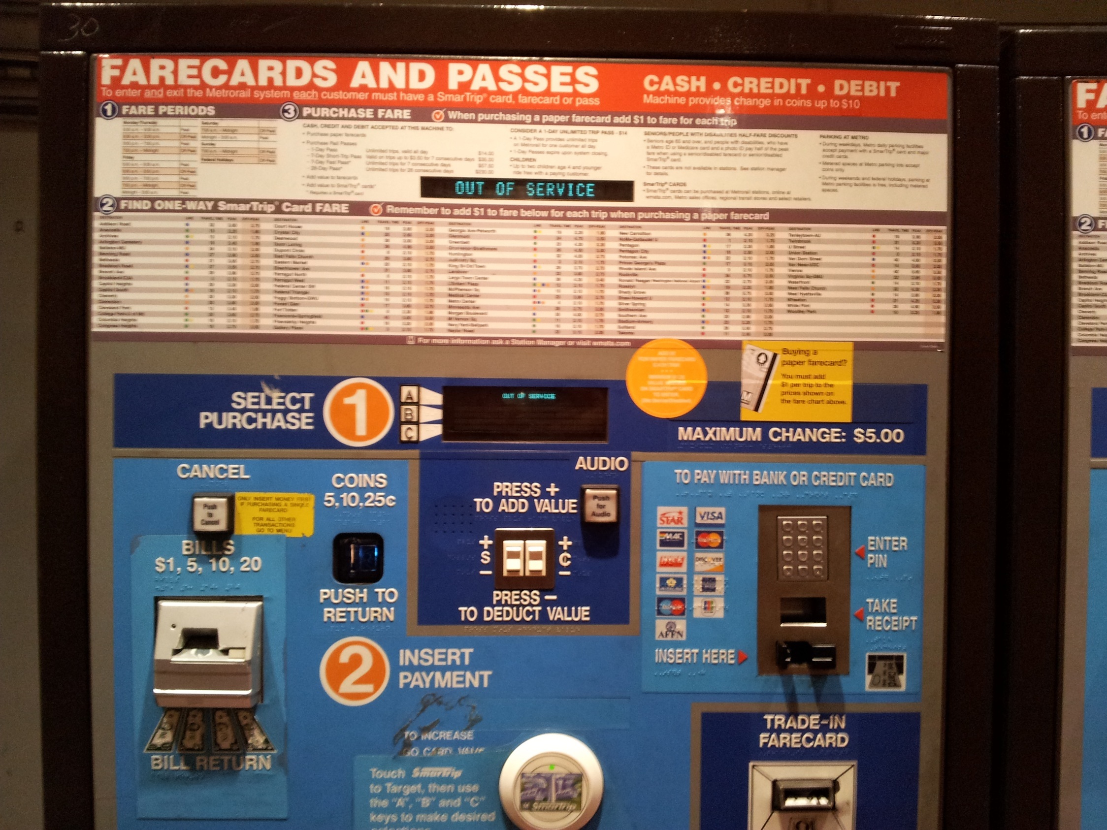 The higher part of the panel ask you to calculate your fare according to the city zone and peak or off peak fare, then you are asked to choose between several options (Smart Trip card, farecard or Pass?) of which of course you know nothing. Then you are let to navigate your way through payment. The panel uses colour coding (dark blue and light blue ares) to facilitate the purchase process. I gave up after few minutes and I decided to follow the only valuable piece of info on display: “for more information ask a Station Manager”.
 So I asked for assistance. A very friendly staff person came to the rescue and purchased for me the two Farecards I needed. As I thanked her I asked her: – “have you ever seen a tourist capable of understanding all this and buy a ticket on their own?”
-“No sir, unless you do not already know the system, there is no way you can understand which option is the right one for you”.
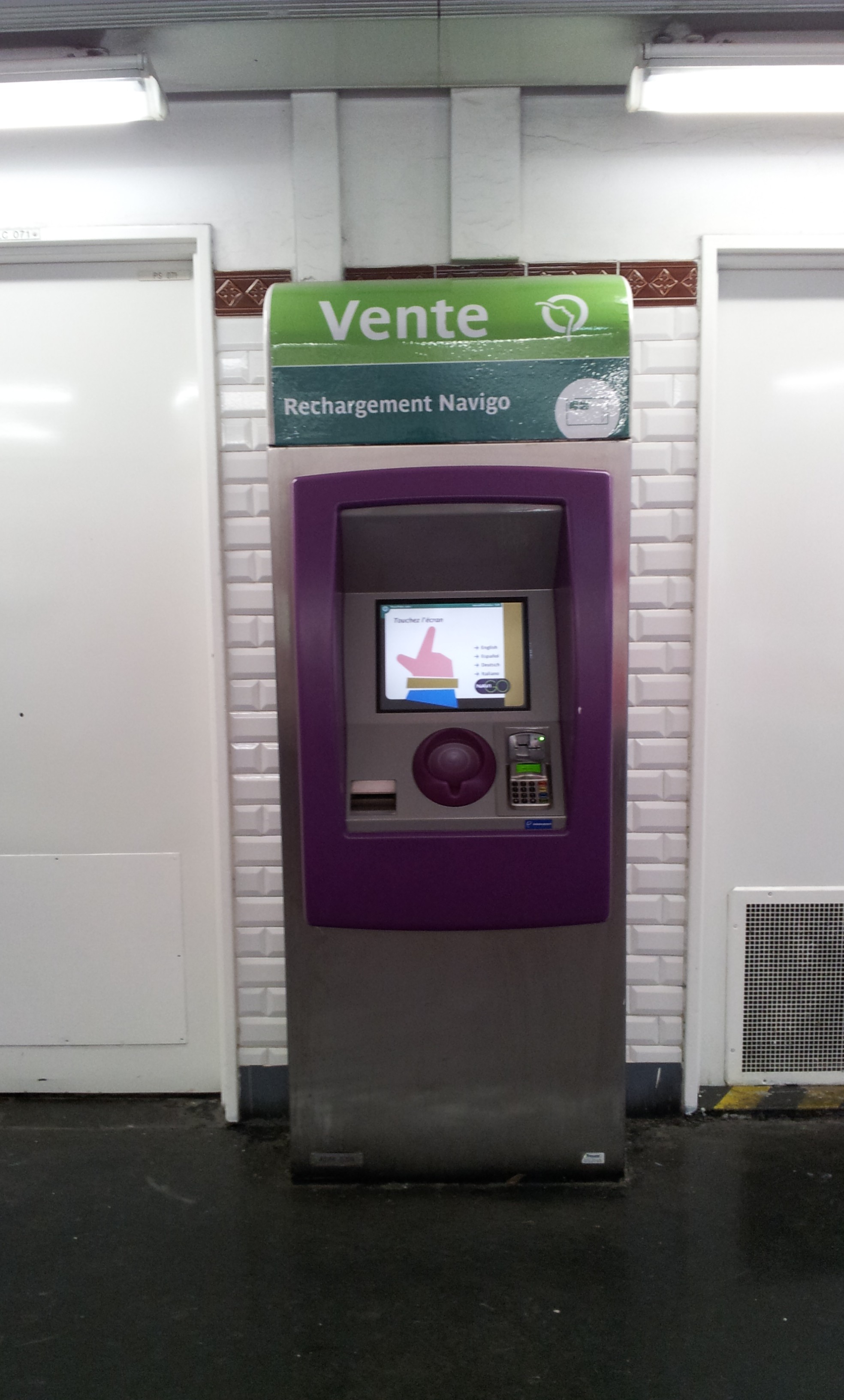
In a nutshell, the negation of usability design. I could not help thinking about the simple and effective roll bar of the vending machines in Paris.