Ok, this gem is for our Italian readers: Last month in Rome I spotted this lovely example of bad communication in a bank office. 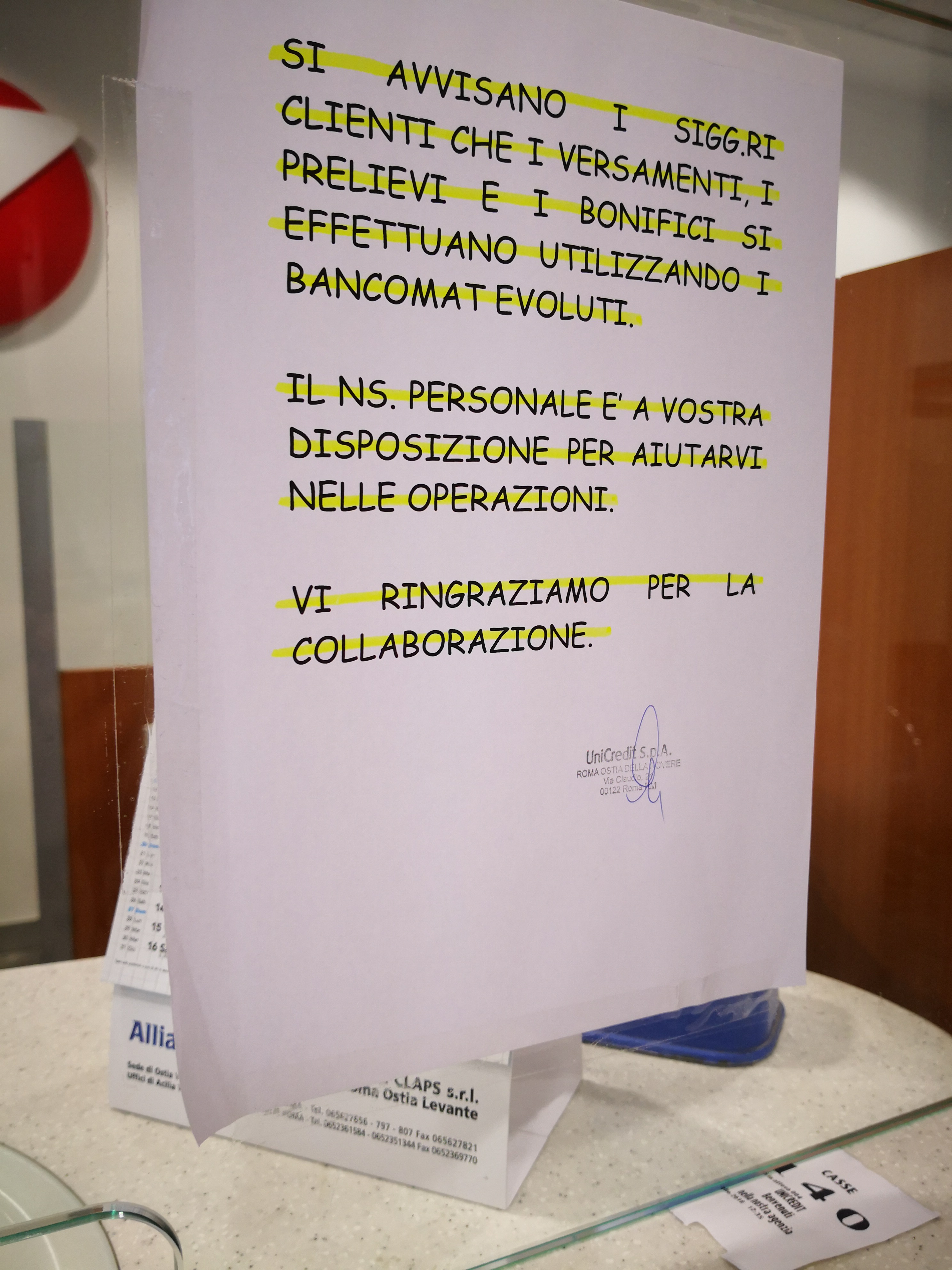
The text informs the clients that new services are available thanks to new teller machines and that personnel is available to assist. The interesting thing (or, the utterly annoying thing, if you are a designer) is how they chose to communicate this important bit of information: instead of a properly designed panel–ideally in line with the sophisticated visual identity of the bank–they went for an A4 paper, obviously designed by one of the clerks, sticked with tape on the glass. The typography is an abomination: all-caps Comic Sans, apostrophes instead of accents, unnecessarily formal language. On top of that, every line of text is highlighted with a fluorescent yellow marker. At the end there is a signature and the stamp of the branch.
The desire of the writer to be taken seriously is evident. And stil the result is pathetic. They managed to condense in one small paper a remarkable number of mistakes. The bank in question has a logo, a color scheme and a distintive typography: these are tools that provide consistency, authority and credibility to their communication. Anything diverging from that style looks unofficial and less credible. The usage of all-caps (READ ME! I AM IMPORTANT!) and silly typography is again a display of sloppiness that does not add any value to the message. But the true masterpiece is the final touch: let’s highlight every single line! And how? With a fluorescent strikeout. It is only apt to note that a line through the text usually indicates text that should be removed.
Next time I go there I’ll suggest they strikeout the stamp as well.