 After my lecture on wayfinding and typefaces at Paris DEC, last friday, I have received an interesting feedback from my friend Valeria Giardino, a Postdoctoral Researcher of the CNRS who was in attendance; apparently one moment of my talk sounded a little bit schizophrenic: let’s stop using the most beautiful typefaces ever created! Look how perfect they are and that’s why we should not use them anymore…
Indeed it seems that I did not make myself very clear on one key point (possibly THE key point of my whole lecture) so a clarification is in order. Here the facts: at a certain point of my presentation, I discussed the development of studies on typefaces and dyslexia: more and more research indicates that there are specific features that make a typeface difficult to read by people with dyslexia.
Especially relevant is the case of those sans serif typefaces where letters such as b, p, q and d are made by one shape only, flipped and rotated.
This parsimony of design has been in use for decades – the reasons are to be found in the cost of casting metal types – and it became a hallmark of distinction: sans serif typefaces set in this way have been praised for their simplicity, their elegance and purity. The more similar the glyphs, the more elegant the whole typeface results.
Now, it turns out that these features are actually a nuisance for dyslexic readers and there is no gentle way to put it: similarities in the shapes of the letters make the text more difficult to read. Hence new typefaces have been redesigned with the specific goal of avoiding identical shapes.
When I displayed an alphabet in a typeface specifically designed for dyslexic readers next to an alphabet set in Frutiger, I said something about the former looking to me like an eyesore and the latter being more beautiful, proportioned, aesthetically pleasing. These remarks were interpreted as passionate complaints about he fact that aesthetic values were ignored in the design of the typefaces for dyslexics.
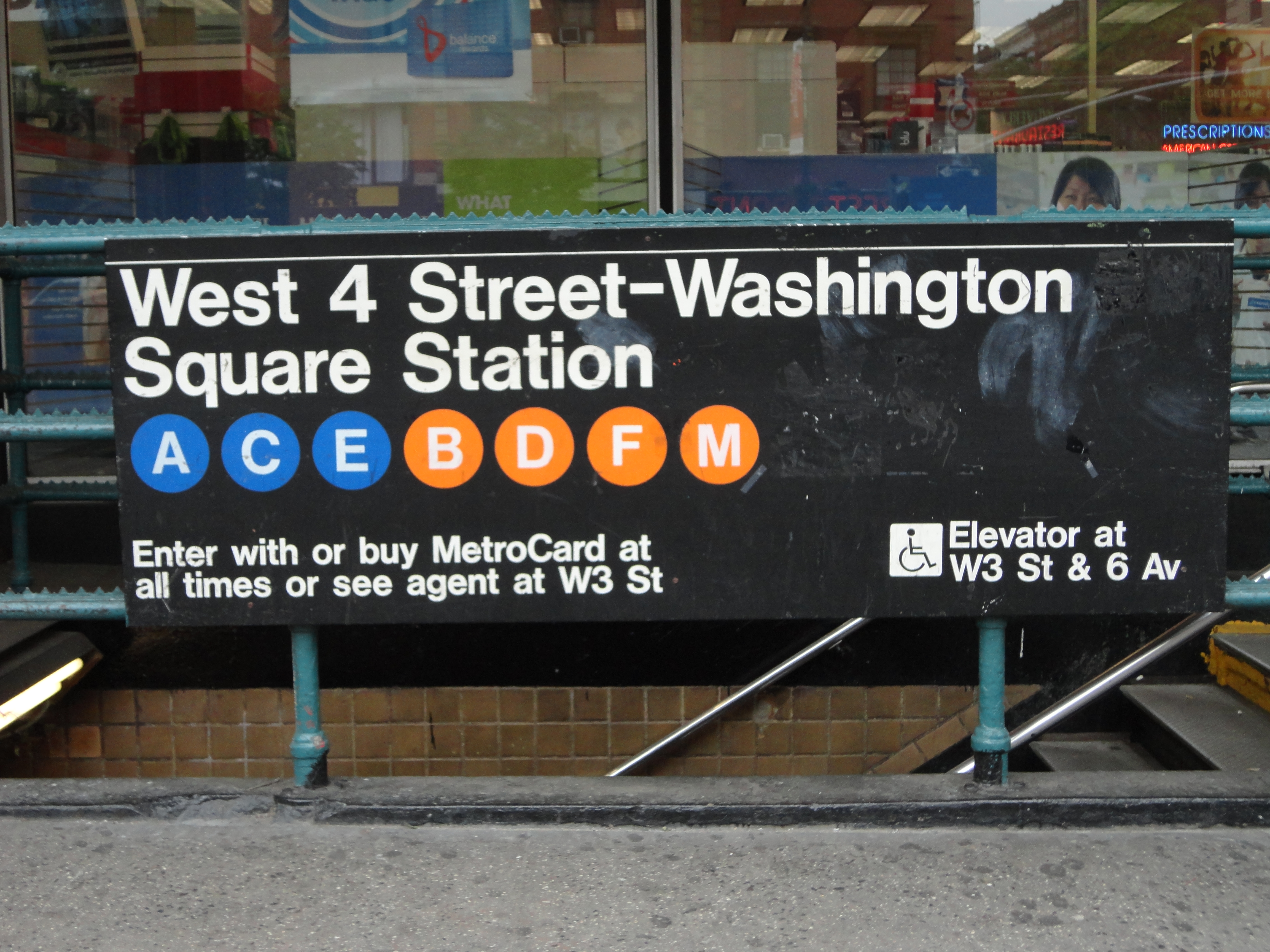
This is the crucial point that must be rectified: I stated – and sadly I think I will be saying it again for the rest of my life – that Frutiger looks indeed so much more beautiful than OpenDyslexic to me. Yes, I appreciate I might have said that very passionately: on a recent trip to Berlin I took more photos of the Metro signs – set in Transit, a beautiful Frutiger condensed type – than of the Pergamon Altar. Yes, I do consider that quest to simplicity a testament of the grandeur of so many type masters of the last decades and yes, I can stare at those lowercases in awe for days. Yes, those letters look nothing but perfect to me.
But.
But if it turns out that research is right, and that those features are an impediment to a more universal fruition of the text, then all those typefaces should be banned from any signage system, until redesigned accordingly. And again, there is no way to put it down mildly: do we want our designs to be accessible, yes or no? Would we condone non inclusive contemporary architecture? Would we approve of a new building inaccessible by people on a wheelchair? We can still appreciate the exquisite elegance of the Spanish Steps in Rome – built in 1725 – but we know that nowadays we would have built it as a gentle slope without a single step.
So, do I mean that the overwhelming majority of wayfinding systems in place nowadays are wrong? Yes. Of course, they are wrong. Do I mean that they should all be redesigned, taking users with dyslexia into account? Yes. Of course. We should not allow any sign to be unnecessarily difficult to read anymore than we allow a mall or a car park to be unnecessarily difficult to access. There is way more dyslexic people than people using wheelchairs.
Do I mean to say that typefaces such as Johnston Underground, Frutiger, Transit – to name but three of the most exquisite sans serif ever designed – should not be used anymore? I am afraid I do. There is no contradiction here; just the acknowledgment of scientific and social progress. It is 2014 and we now know what makes those typefaces not ideal and we should simply acknowledge this; after all they were created with the intention to solve problems, to be inclusive. Now that we know that this is not the case, we have to act accordingly. That does not mean they are not beautiful anymore. They are and they will always be. And just like a trip to Rome will inspire generations of architects, so the identical shapes of the beautifully designed lowercase d p q and b of many sans serif typefaces will continue to inspire generations of designers. But their time as preferred choice for signage system is over. And it is our duty to make this happen sooner than later.