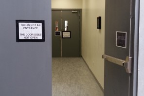
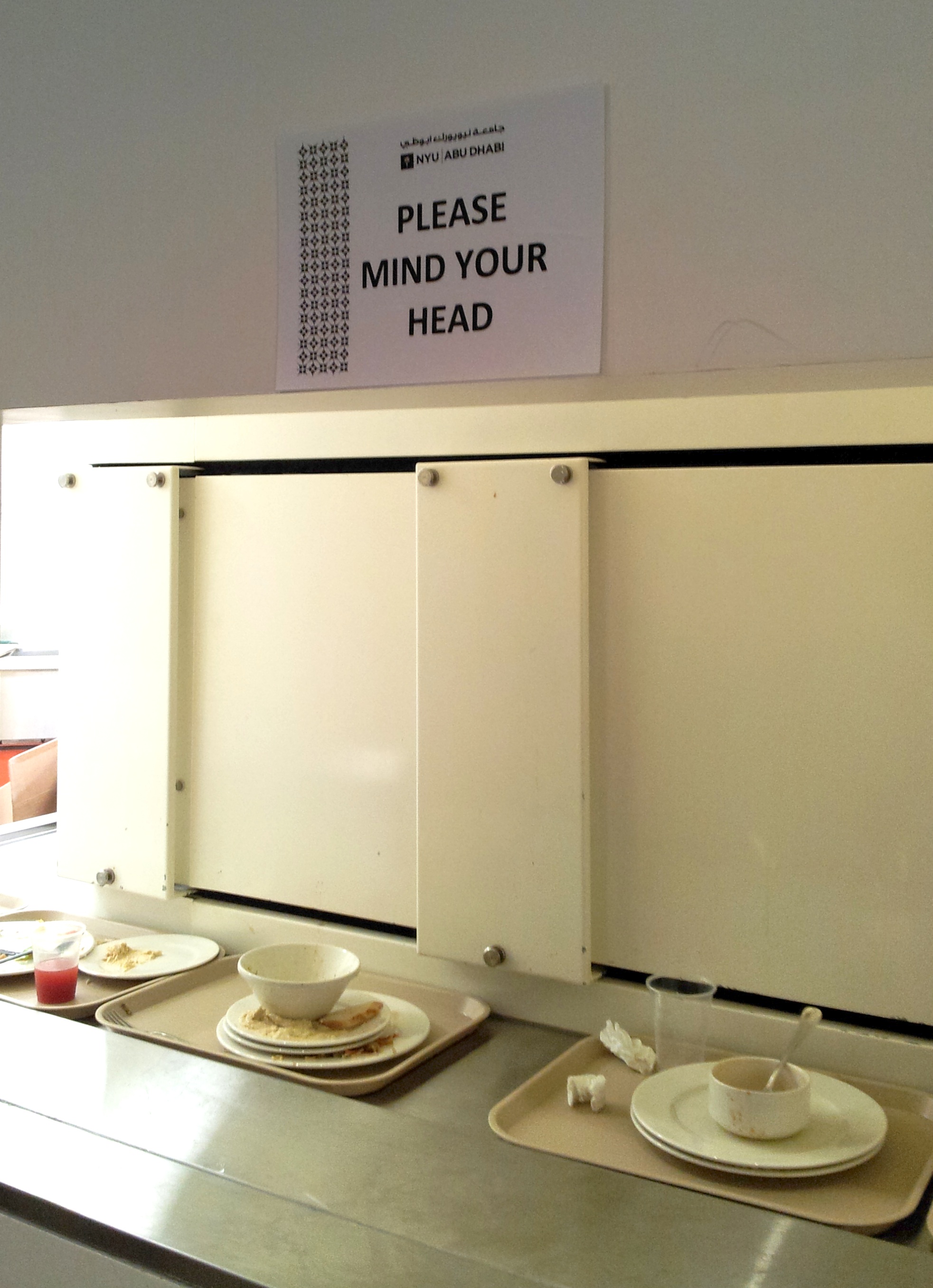
 Remedial design is rarely something to be proud of as it is often the evidence of a fawlty feature. In the photo above you see the clearing station in our campus’ cafeteria: it has been designed so badly it is almost a cruel joke: you are invited to leave your tray on the belt to facilitate the cleaners’ job, and so you lean to place it properly and: Bang! You hit your head on the light colored wall. This annoying thing has being going on for a while and now a sign has appeared, politely begging users to mind their head. That, of course, is not the solution. Accidents are occurring not because we do not mind our head; we are not talking about the gap between the train and the platform on the London Underground, a sometimes inevitable problem which has been addressed in many ways, including ubiquitous signs and repeated mantra-like voice-over messages; here we are talking about bad interior design. The solution to bad design is good design and nothing else. The tray belt must run closer to the window in the wall. Or the window must be bigger. If we really must be content with remedial design, then I suggest protective foam panels and a rewording of the sign because people will continue to hit their head. Design (bad or good) is more powerful than any warning.
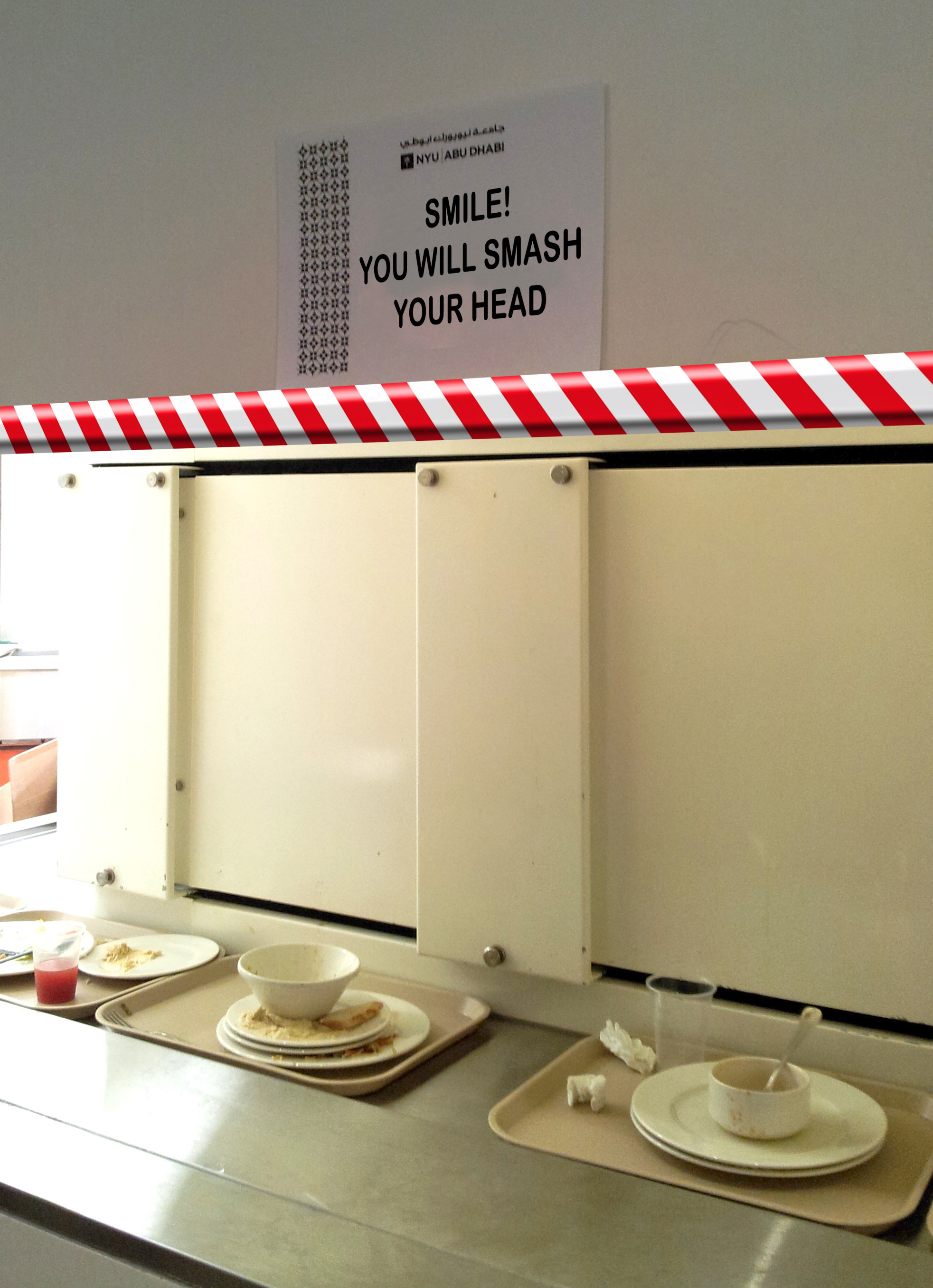
Disclosure: if you sense hints of sarcasm in the post, I do apologise and admit: yes, I did hit my head more than once. Yes, it hurts! 🙂