The title of this article is a pun of the famous FedEx slogan of the 80’s: When it absolutely, positively has to be there overnight.
FedEx is one of the most quoted companies in all graphic design classes of the world. A case history of a near perfect visual identity program, sustained by advertising campaigns and product placement operations without parallel (do you remember the movie Castaway with Tom Hanks?), and, above all, by one of the most clever logos ever designed. The famous blue and orange logo with the ‘hidden arrow’ – can you see it? It is in white between the E and the x – is the mandatory example for logos that makes the most of negative space: a bold big arrow, a vector, the most perfect symbol for moving objects, naturally emerges between the letters that constitute the company names. Simple, effective, perfect.
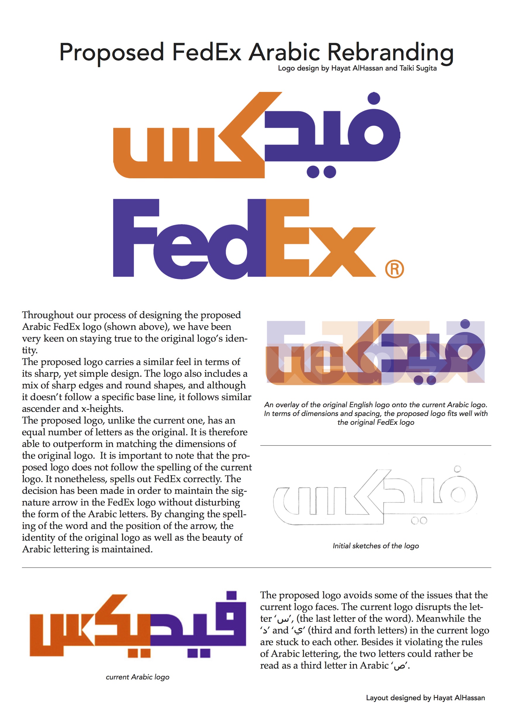
And how does the arabic version of the FedEx logo looks like? In the last two decades Arabic Logo Matchmaking has become almost a discipline in itself, with hundreds of western brands wanting (when not being required by local laws) to appeal to local audiences by presenting themselves using arabic versions of their signatures. It is indeed a big challenge for a designer to be asked to create the arabic counterpart of a latin logo. Many factors are indeed to be considered from calligraphy styles to phonetics; now you would expect that when a corporation such as FedEx brings its business in the Arab world they would jump on the opportunity to have, once again, a beautifully designed logo; something elegant, neat and precise to match the refinement of the english one. Well, think again.
The arabic version of the Fedex logo is an insult to the arabic script: if you are not familiar with the basic rules of grammar and style, there is probably no way to convey to you how grotesque is the attempt to mimic the latin uppercases using arabic letters, or how pathetic is the way they managed to squeeze an arrow in the letter sin: basically they just chopped away bits of the letters to make an arrow appear. Brutal! And aesthetically horrid. They have another slightly different version of the logo around; it is appalling too.
Now just consider the pictures in this article. They are the outcome of a three hours exercise I gave to my students. They split in three groups and in such a short amount of time they came up with three proposals, all of them vastly superior to the current one. They suggested a new phonetic transliteration and produced designs where the hidden arrow appears out of negative space alone, as in the english one, without flagrant violations of grammar or stylistic norms. Lively accounts of the exercise as seen from students perspective can be read here and here.
Three hours is all that it takes to a bunch of motivated students to come up with a more appropriate arabic companion for one of the most iconic logos in the world. Hey FedEx, do you want their phone numbers?
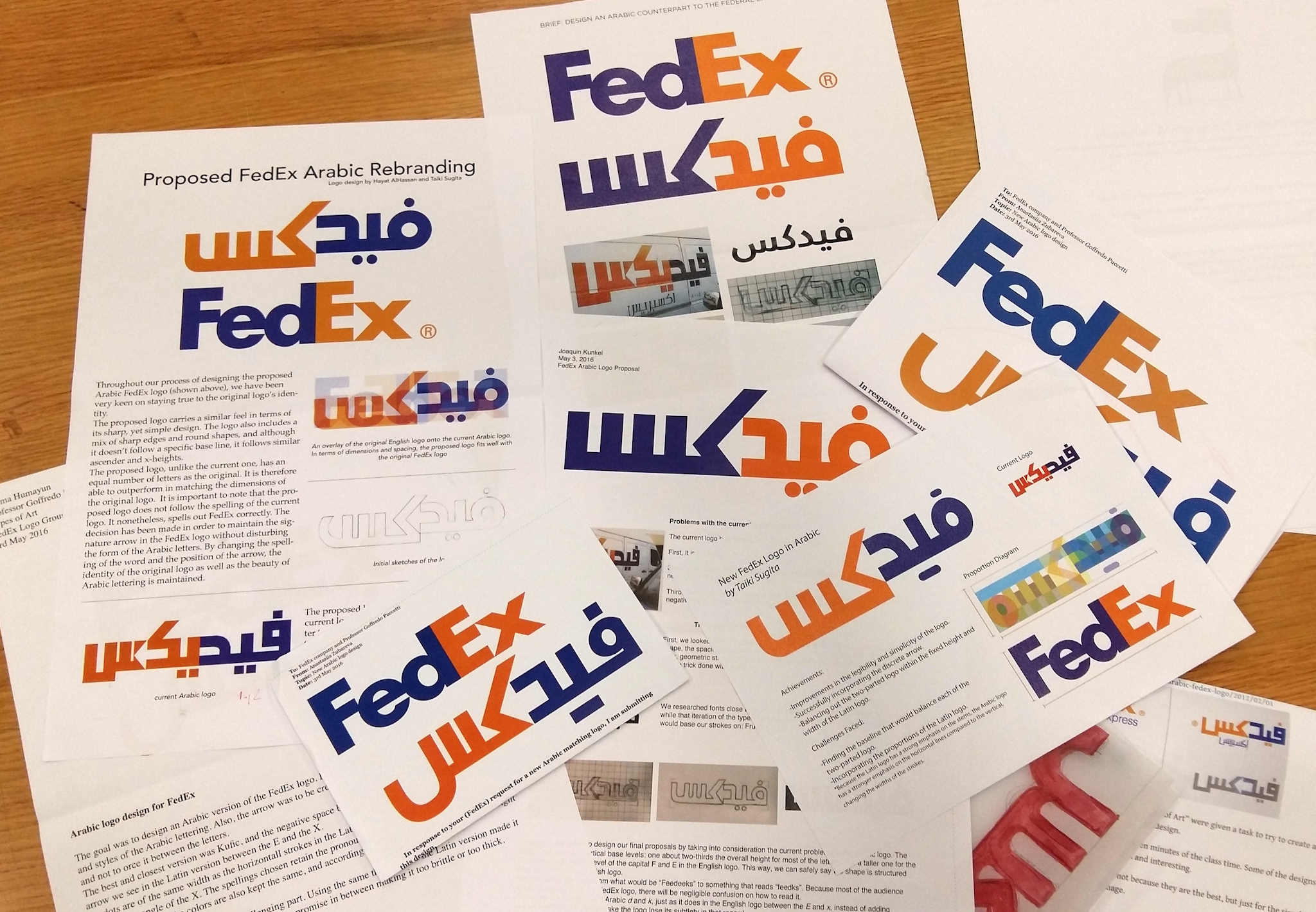
Here below, one of the most interesting proposals by students Hayat Al Hassan and Taikj Sugita: